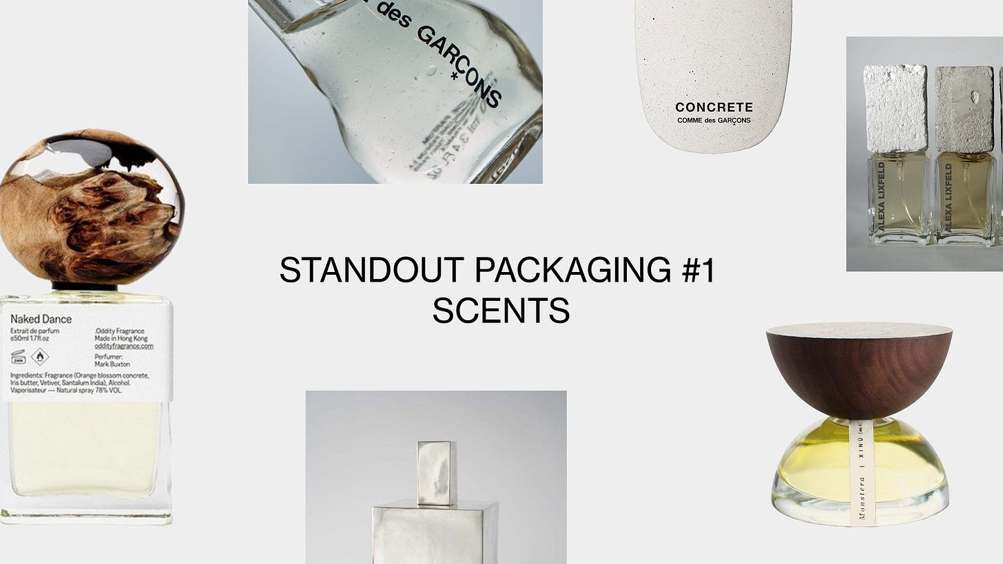
Standout Packaging #1: Scents
Does the bottle matter more than the scent?
What’s up everyone hope you’re having a great Thursday morning. I just ran 6 miles on 4hrs of sleep and I am feeling dehydrated. Just know we are not letting off the gas: let’s talk about packaging design.
Product packaging is one of the most important things to get right for consumer packaged goods (CPGs) and many brands can get a little lazy.
Specifically in the world of scents, so many packages are a bit too minimal and lack depth. You’re not going to do do minimal better than Aesop or Maison Louis Marie. Packaging is an art, and is often time the only physical touchpoint brands have with consumers, and brands should be thinking about how to leverage this tactile interaction to tell their story.
Let’s break down 2 ways to stand out: materials & shape
Materials
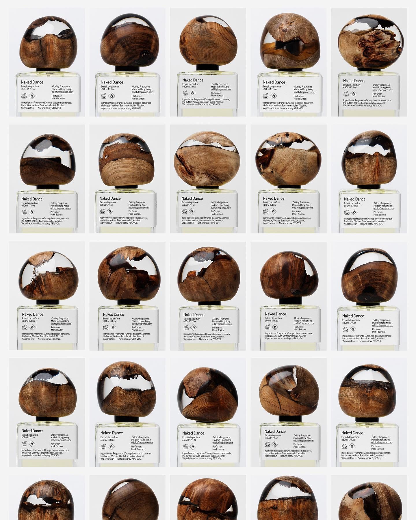
Oddity Fragrance
Oddity Fragrance uses distinct oversized caps on their bottles both in wooden and a or metallic finish. This signature motif has become their staple, which visually communicates their brand while keeping the glass packaging simple.
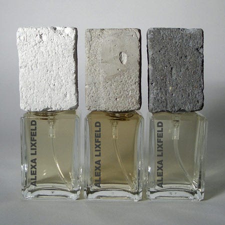
Alexa Lixfeld
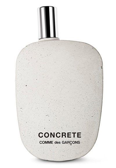
Alexa Lixfeld uses a similar approach but uses concrete for their oversized caps. I love the concrete aesthetic and will be doing a newsletter breaking down how concrete brutalism is pervading many other products. The concrete cap, mixed with the bold sans serif logo and muted tones of the perfume are chefs kiss
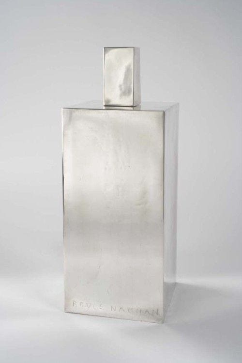
Bruce Nauman (Concept)
Bruce Nauman is an acclaimed sculptor who made his own rendition of a parfum bottle in metal. I can imagine this has a nice weight to it, and would evoke a very luxury, but utilitarian feel in person.
Kerosene
Lastly, Kerosene uses this distinct metal tile on their packaging, with embosses messy typography. It sort of evokes a classic office nameplate.
Shape
Comme Des Garcons
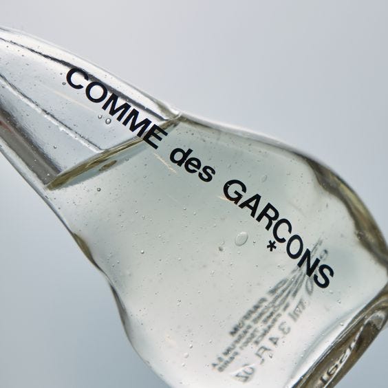
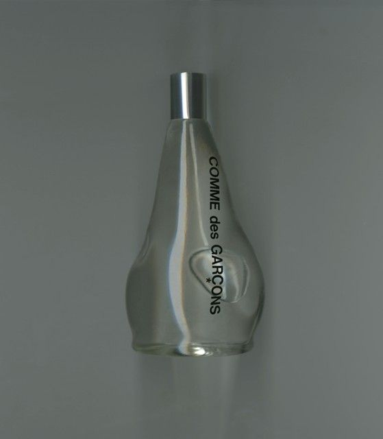
Distorting your bottles shape is a great way to make it stand out from the peers. Comme Des Garcon is one of the innovators with their infamous shape.
But they have iterated on special occasions, creating this bottle that fits well in the contours of the hand.
Amber Noir
I love this example from Amber Noir which suspends the scent in glass making for a striking visual.
Montsera
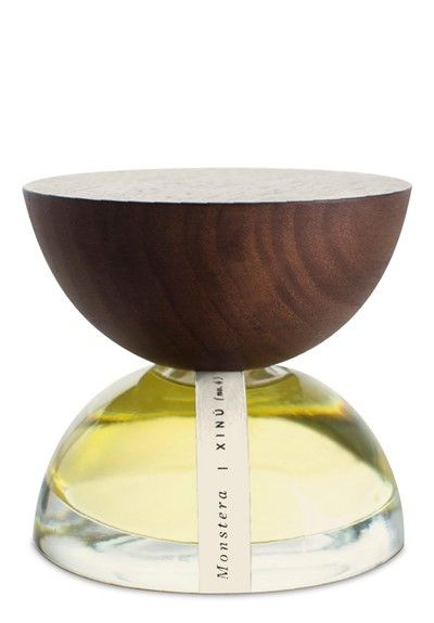
Montsera creates an interesting juxtaposition between the oversized cap and the bottle, creating clean symmetry.
Why It Matters
Each one of these brands is using their packaging to further communicate their brands story. The packaging choices they have made not only help them standout on store shelves and e-commerce, but work to communicate the brands ethos in a physical representation. They are tactile, real and the essence that your target consumer will be interacting with on a daily basis: so make it out.
Bye
Okay I am going to go drink some Ladder electrolyte powder and prep for a sick activation I have tonight. Goodbye and see you tomorrow for a BANGER newsletter. Subscribe so you don’t miss it.
About Jake Bell
Jake Bell is a content marketing strategist based in NYC. He specializes in branding, art direction, creative strategy, content creation, and making things cool.
To get in touch visit www.jb.studio
Like video? Check out his TikTok
Like fit pics and pictures of chairs? Visit his Instagram.


