

Should You Advertise on the Guggenheim?
Insights on marketing, business, branding, products, design, founders, and culture.


GM everyone.
Over the weekend I celebrated my girlfriend’s birthday. One of the gifts I got her was day passes for us to visit Bathhouse, a new wellness destination here in NYC, offering a saunas, cold plunges, massages, and a restaurant.
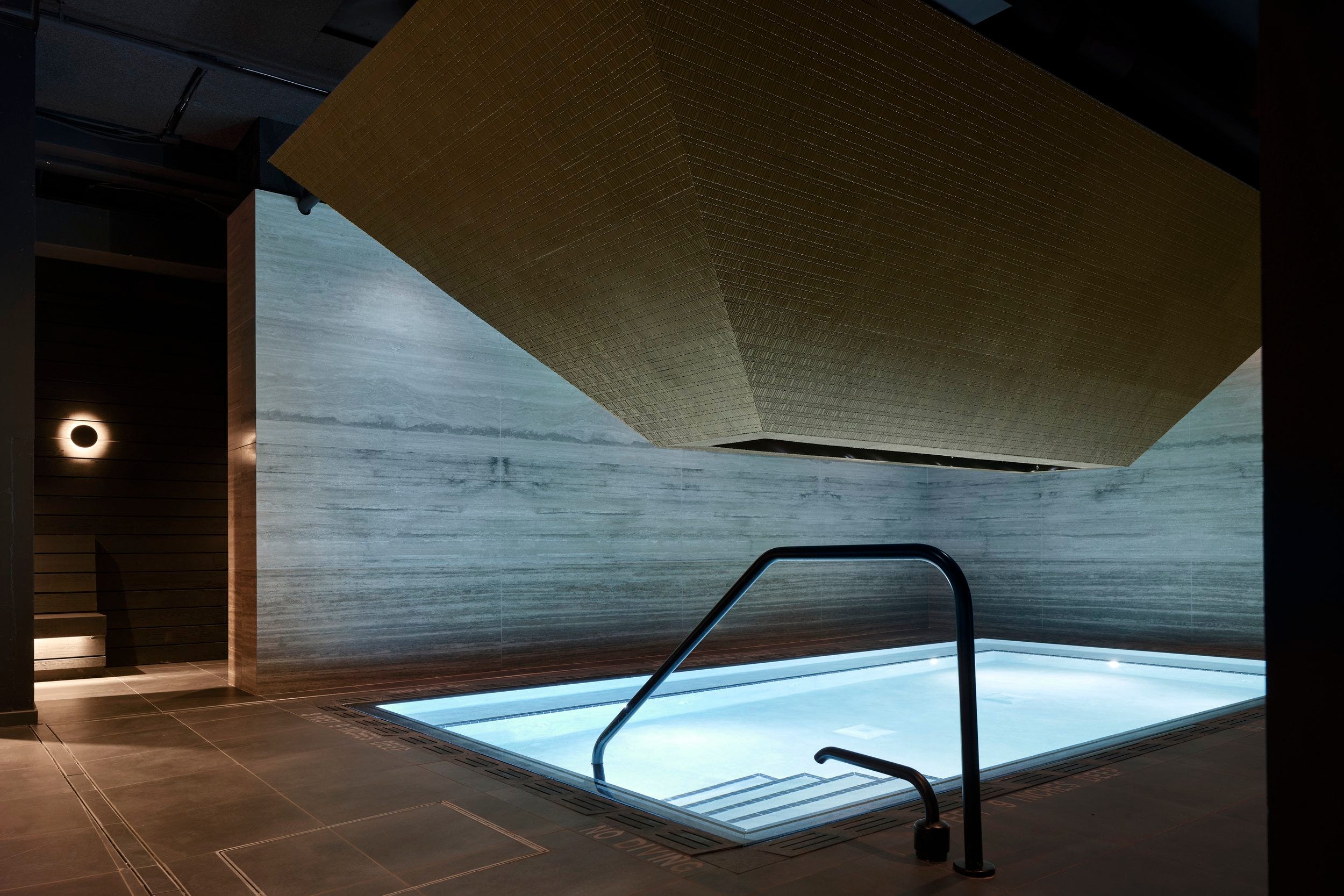
Unlike other spas and saunas where you can hear a pin drop, Bathhouse is designed to live at the intersection of socialization and relaxation.
The design is Blade Runner-esque, like a dark labyrinth from the future with ambient colored lights and chic architecture.
After a few hours of sweating, cold plunging, and sitting in the heated pool, the last thing I wanted to do is emerge back into Manhattan.
I think any New Yorker needs to a lot a certain amount of capital a month to finding ways to get a reprieve from the city. Whether that is a quick trip elsewhere or just paying $90 to go underground and relax, its worth it for staying sane in the world’s best and most complicated city.
News
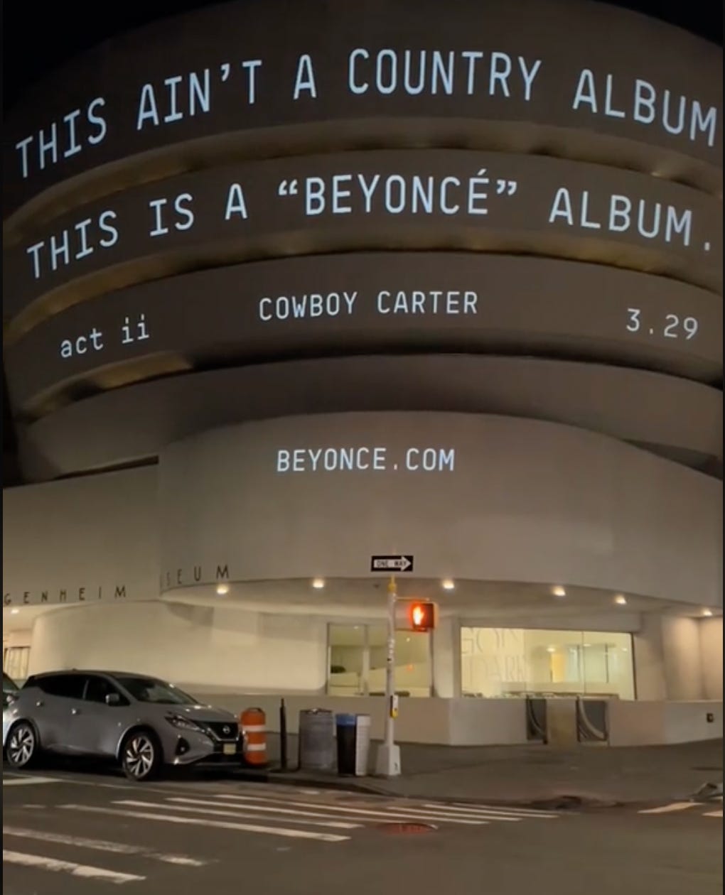
Is the Guggenheim the hottest new ad space? Late last week Beyonce projected a promotion for her forthcoming album on the facade of New York’s Guggenheim.

The projection caused a social media stir, with many debating whether or not the museum was an appropriate place for an album promo. This drama heightened when the Guggenheim released a statement saying that had no prior knowledge or involvement in the ad. Beyonce isn’t the first artist or brand to project on the side of the iconic museum though. Gucci did this to promo their Fall show last year. Prior to that, Yeezy x Gap promoted their infamous blue puffer jacket.
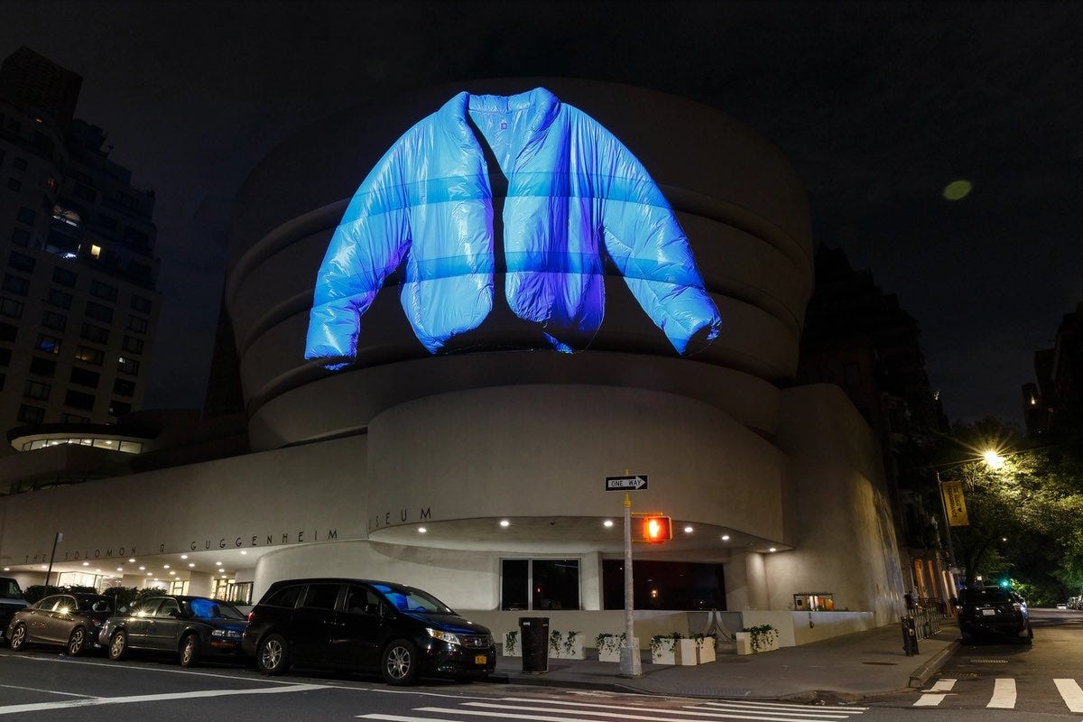
From a tangible ad spend perspective, foot traffic up there is not high at night, so the play here is to get earned media writing about the promo, rather than people just seeing it on their own.

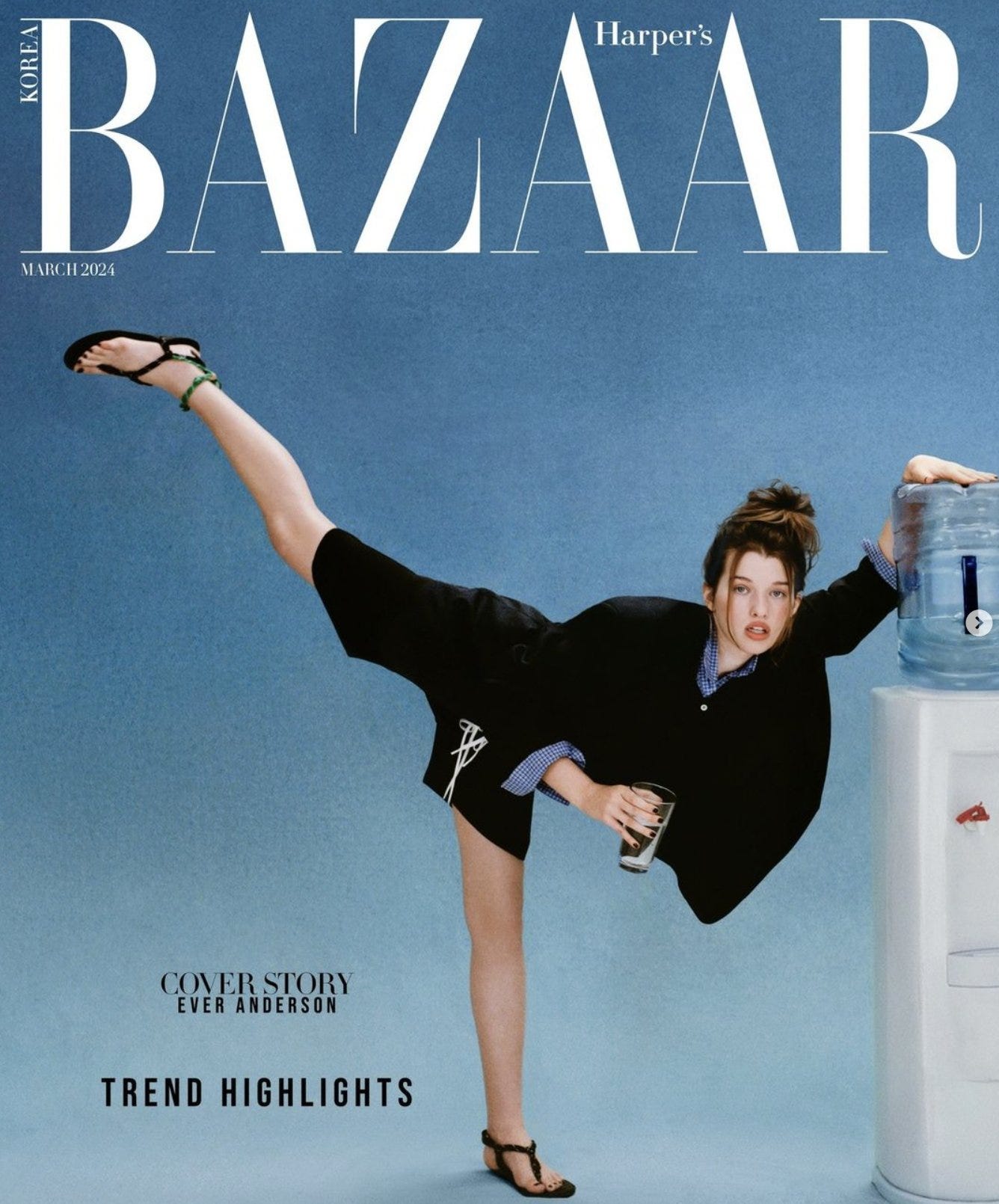
Officecore remains the hottest art direction aesthetic of 2024. Harper’s Bazaar’s March issue featured cover star Emily Anderson in chic business attire posed next to a water cooler. We’ve seen this ‘return to work’ aesthetic used across various brand and editorial shoots (Kim K GQ) Emily Sundberg wrote an in-depth analyzation of this trend on her letter Feed Me. This art direction style has entered the lexicon, and we are going to continue to see this style across fashion, tech, and product campaigns throughout ‘24, and as more businesses return to the office.
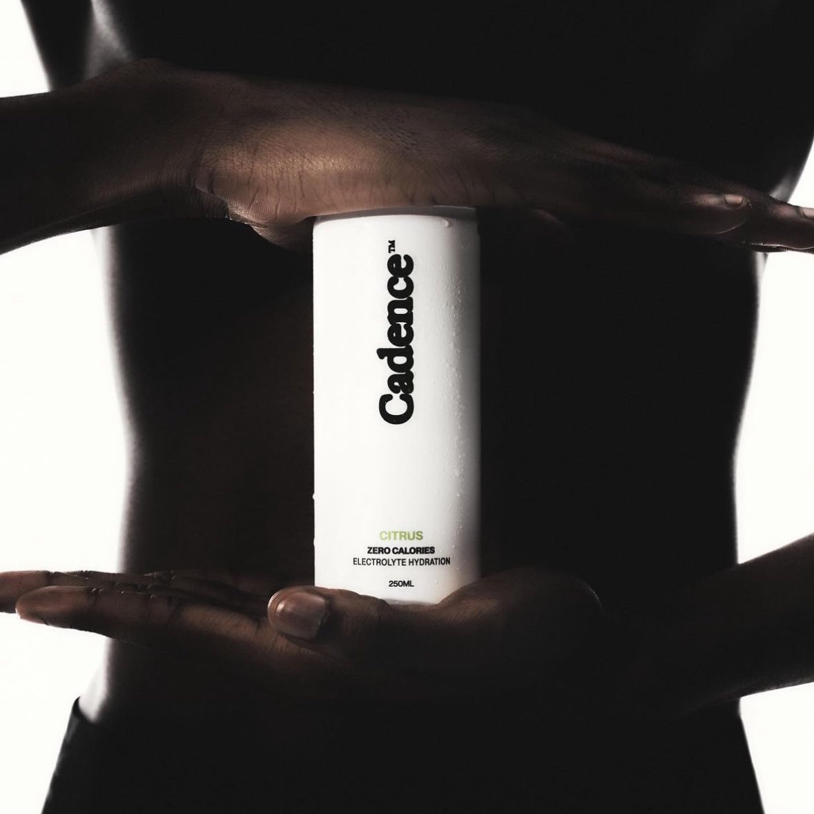
Cadence is launching an electrolyte drink with minimalist packaging. The new beverage stands out amidst of other hydration drinks with its simple black and white color palette and distinctive typeface. I am seeing a drastic switch to black and white designs across brands in consumer, tech, and fashion. Something about stripping back to the basics is in vogue rn. I’ve discussed this before, but if you’re entering a crowded space, differentiating your packaging is a crucial step in standing out and visually communicating novelty to consumers.

Who Do You Know? is a daily newsletter covering marketing, business, branding, products, design, founders, and culture.
Its written by Jake Bell, a content marketing and brand strategist in NYC.
To get in touch visit www.jb.studio or email jake@jb.studio