

Rimowa's New Suitcase is Kind of Ugly
Insights on marketing, business, branding, products, design, founders, and culture.


Good morning everyone. Hope everyone enjoyed the eclipse yesterday. Everyone in New York should stop working and stare at the sky everyday. It spices things up.
Today I want to discuss Rimowa’s new suitcase, a lesson in brand differentiation, and the DTC stock apocalypse…
News
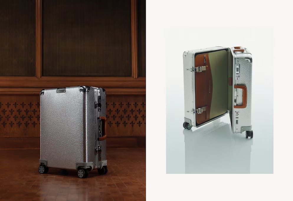
Rimowa has debuted a new suitcase collection. The iconic luggage maker introduced the Hammerschlag, featuring a textured aluminum body inspired by a 1966 case.

This is the brand’s first departure from their traditional design in quite some time. It is pretty hard to beat the timelessly chic aesthetic of a normal Rimowa. But the brand has such a rich history of designs they can tap for future projects like this.

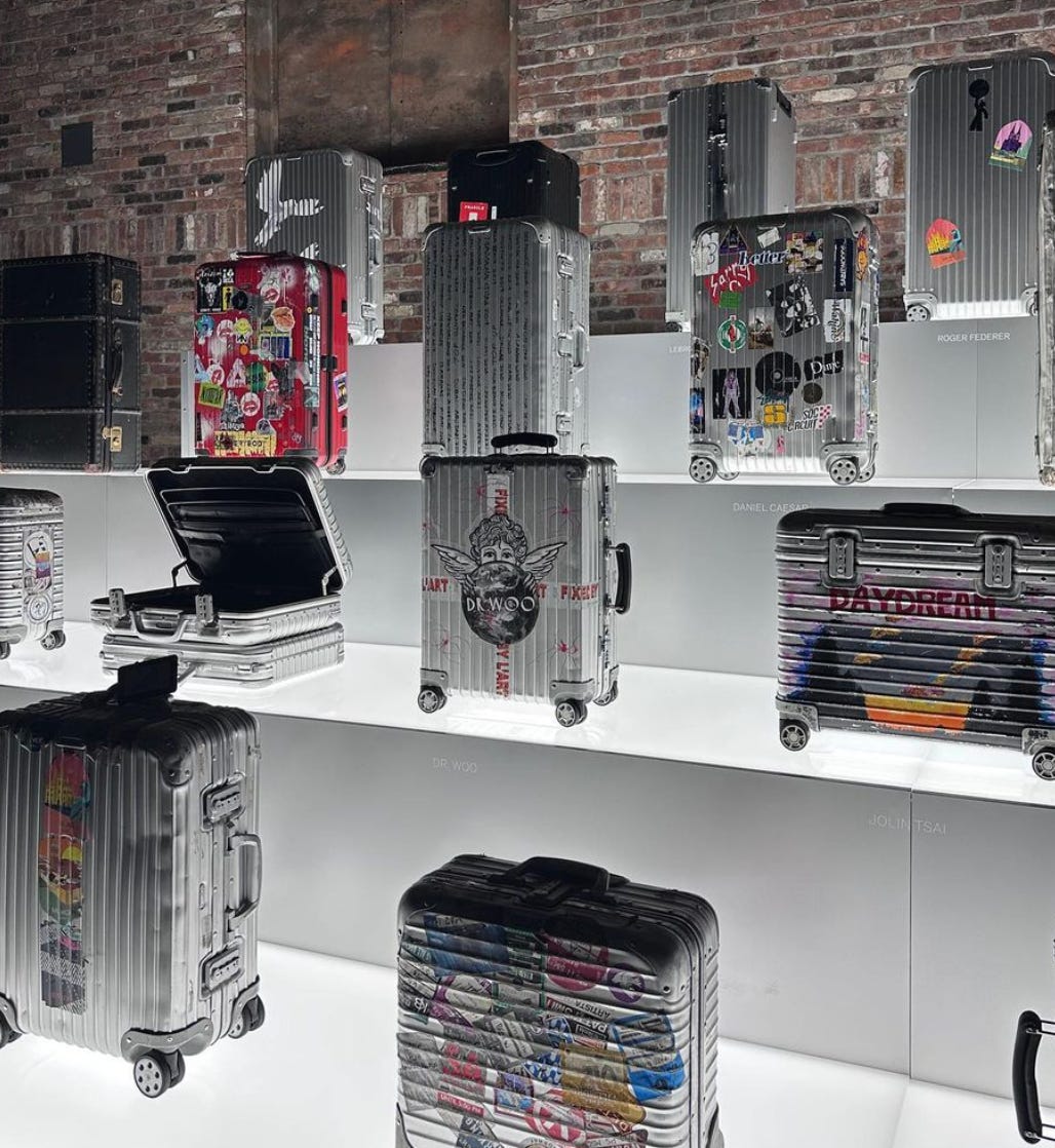
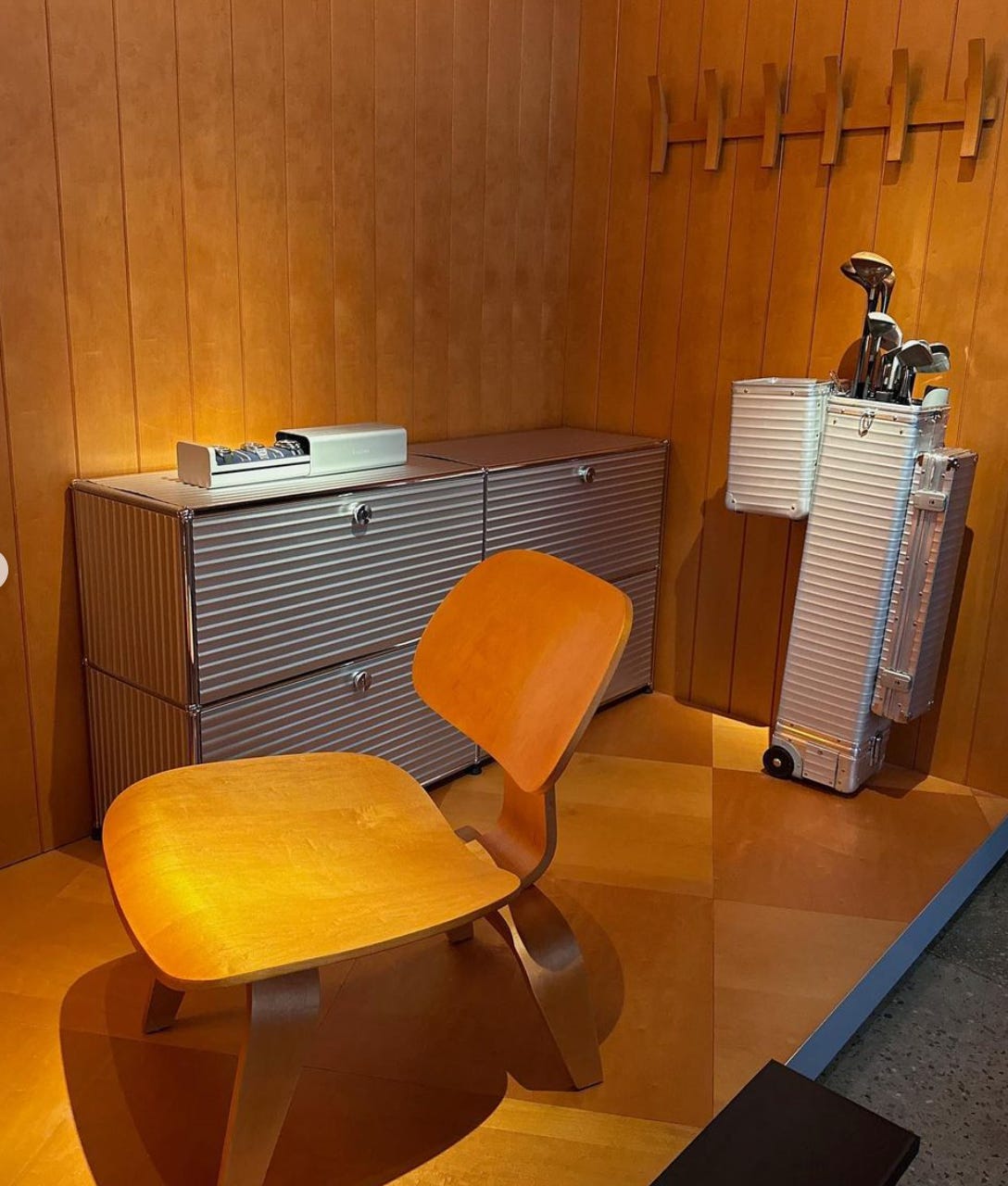
I went to the Rimowa exhibit last Summer here in NYC and it was incredible to see some of the collaborations the brand has done over the years, and special one-off projects like a Rimowa golf bag.

While I do think the Hammerschlag is a little ugly, the brand will find die-hard fans who will purchase. My only critique with the rollout is that they could have done more to show the craftsmanship of the new bag. Like drop a video on social showing how its made.
How a distinct brand can help you stand out. If you’ve ever browsed for olive oil at Whole Foods, you’ll know that most brands use the same aesthetic and old motifs for their packaging. Green glass bottle, olive illustrations, and heritage fonts. Then came Graza, which basically looked at what everyone else was doing and decided to do the opposite. Now look at this photo—
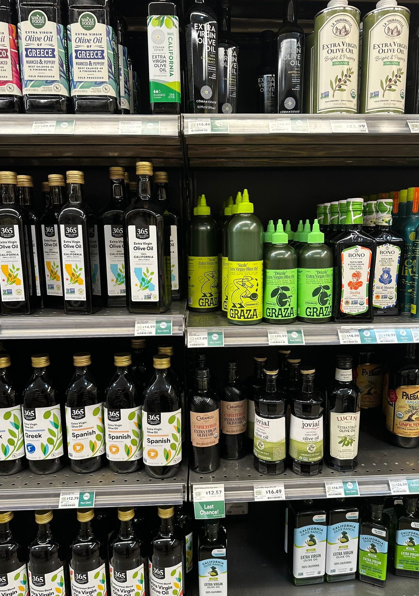
By forgoing the classic design elements and creating a bold, distinctive brand, Graza has been able to stand out amongst competitors on shelves. In many ways we can also look to Burberry’s recent design shift as an example from the fashion world.
In an industry where many heritage brands dropped their original logos for sans serif, basic wordmarks, and put all of their clothes in sparse, white packaging, Burberry’s recent departure stands out.
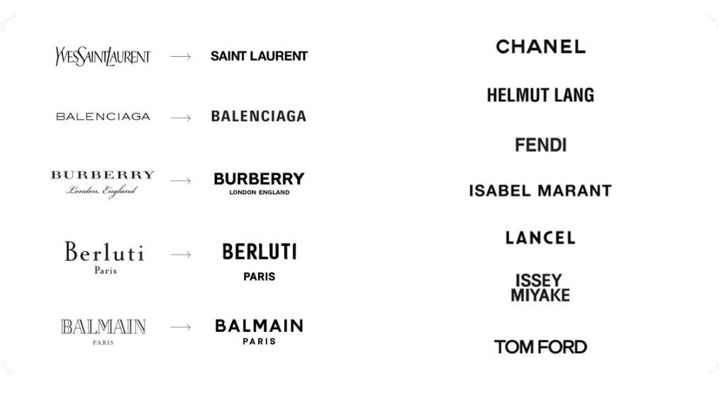
They’ve brought back the maximalist aesthetic of their iconic logo, and leaned into a bright distinctive blue color for their packaging and as a design motif in the collections.
The lesson here for new brands is you have to do something unique to stand out in a crowded market. Yes, it will have a divisive reaction, but that’s the point.
Allbirds has to boost its stock price or else. The struggling tech bro and normie shoe maker has received a notice from the Nasdaq that it must raise its stock price above $1 for 10 consecutive trading days or risk being delisted from the exchange. This follows a 90% dip in price from the brands IPO in 2021. Over the last few months, we’ve seen how disastrous IPOs have been for many direct to consumer brands. Ben Cogan broke this down on X over the weekend.

So many DTC brands across sectors have struggled to retain value in an era where investors favor profitability over growth. The cash simply isn’t there, and many of these firms end up being acquired at substantially lower valuations or going bankrupt.

See you all tomorrow!
Who Do You Know? is a daily newsletter covering marketing, business, branding, products, design, founders, and culture.
Its written by Jake Bell, a content marketing and brand strategist in NYC.
To get in touch visit www.jb.studio or email jake@jb.studio