🪑 Inside Herman Miller's Rebrand
An Interview with Jesse Reed of Order, a design agency.
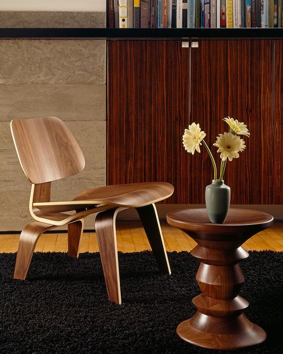
GM all. Herman Miller has long been one of my favorite brands. Founded in 1923, they have produced some of the most timeless furniture designs known for their functionality and style. A few of their hits include—
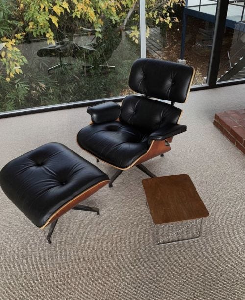
Eames Chair
Plywood Molded Chair (won Time Magazine’s design of the century award)
Aeron office chair
A custom Eames chair with espresso brown wood and forest green leather is in my future.
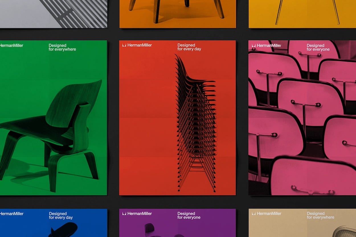
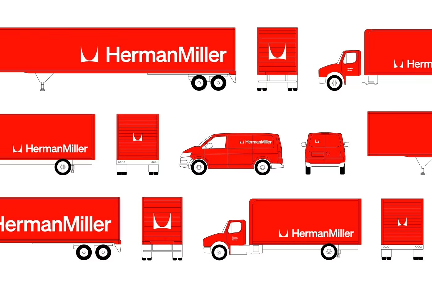
The brand recently completed a long-awaited rebrand on the heels of their 100th anniversary. This new design system takes cues from the brand’s mid-century design system, while adapting for today’s extensive use cases.
I had the privilege of speaking with the Brooklyn-based agency who handled the rebrand, Order Design. One of their founders, Jesse Reed, gave me all the details on how this agency gave a fresh spin on one of the world’s most iconic brands—
Elaborate a bit behind the design process. I can imagine with a brand as iconic as Herman Miller, there is so much source material to pull from for inspiration? What eras, motifs, and themes felt natural to evolve?
Herman Miller approached us with a not-so-simple design challenge, which was to rethink the entire global brand and how it shows up across every touchpoint imaginable. This wasn’t an arbitrary ask, but one fueled by multiple changes in the organization’s business strategy. For one, the company now lives under the Miller Knoll umbrella, which only strengthens their reach alongside all of the other MK brands. Parallel to that, the visual identity they’ve had for the last 25 years had served them well, but it wasn’t designed to meet the needs of digital, social, and brick & mortar environments.
So, our real challenge was to develop a design system that retained the incredible heritage of Herman Miller, while accounting for new and future applications of the visual brand. To do this, we worked very closely with the Herman Miller team to reflect the essence of who they were. The company has always stood for the same values—problem-solving, quality production, and having the highest standards—but the real secret ingredient was the joy and playful expression. Our attention turned towards the company’s history that celebrated these more emotional moments (something that was there from the start), and bring them back to the forefront.
What are some of the challenges in a rebrand of this scope?
One of the primary considerations for a project like this is retaining the historical brand equity, while moving the needle forward in a responsible way. To do this, we look to the past to understand the current and future possibilities of the company. We spent time in the Herman Miller archives in Zeeland, MI and found a treasure trove of materials. What struck us was the playfulness of their personality from the very start. Their designers weren’t afraid of color, scale, illustration, and happy accidents. In our line of work, which can be often very corporate with a capital-C, this sort of human gesture is often lost or unwelcome. On the contrary, Herman Miller’s history with personal taste and the objects that we live with in our homes, i.e. furniture, has always been what made them unique in this industry.
To that end, we also focused on the period in which most of this expression also came to a head with absolute clarity and conviction. In the late 1960s Herman Miller worked with Chicago-designer John Massey to strengthen the design system, which he did so to a tee. A few years after this new system the company hired their first in-house graphic designer, Steve Frykholm, who would later be responsible for bringing a more emotional quality into the company's graphic language (not to mention their incredible series of picnic posters). In the 1990s this playfulness began to recede, and the brand became much more contained. And so, our new design system leverages the playfulness of Herman Miller’s most early collaborations, with the period of the company in which their furniture became solidified into the modernist canon, all with the structure to move into more digital and physical spaces with clarity and ease.
Today brands have so many touchpoints with consumers / audiences? Is it more difficult than ever to design for each of these unique touch points and future proof the design system?
In a sense, yes, it seems extremely daunting to designer for every possible use case. That said, we apply a methodology that accounts for such circumstances, which is more reductive in approach. We only use a few ingredients at a time, and no matter if it’s print or digital or physical signage, the results usually work out if you follow this protocol. And words also play a huge role in each application, and by that I mean, what is the message? The typeface, colors, and logo will all stay the same, but depending on what words you (they) choose to use can greatly alter the design and outcome. This is where the in-house team has the most agency and room to build on the design system and make it their own.
Feel free to add anything else you'd like to share or point out. I think the rebrand is fantastic and there's so much to potentially explore.
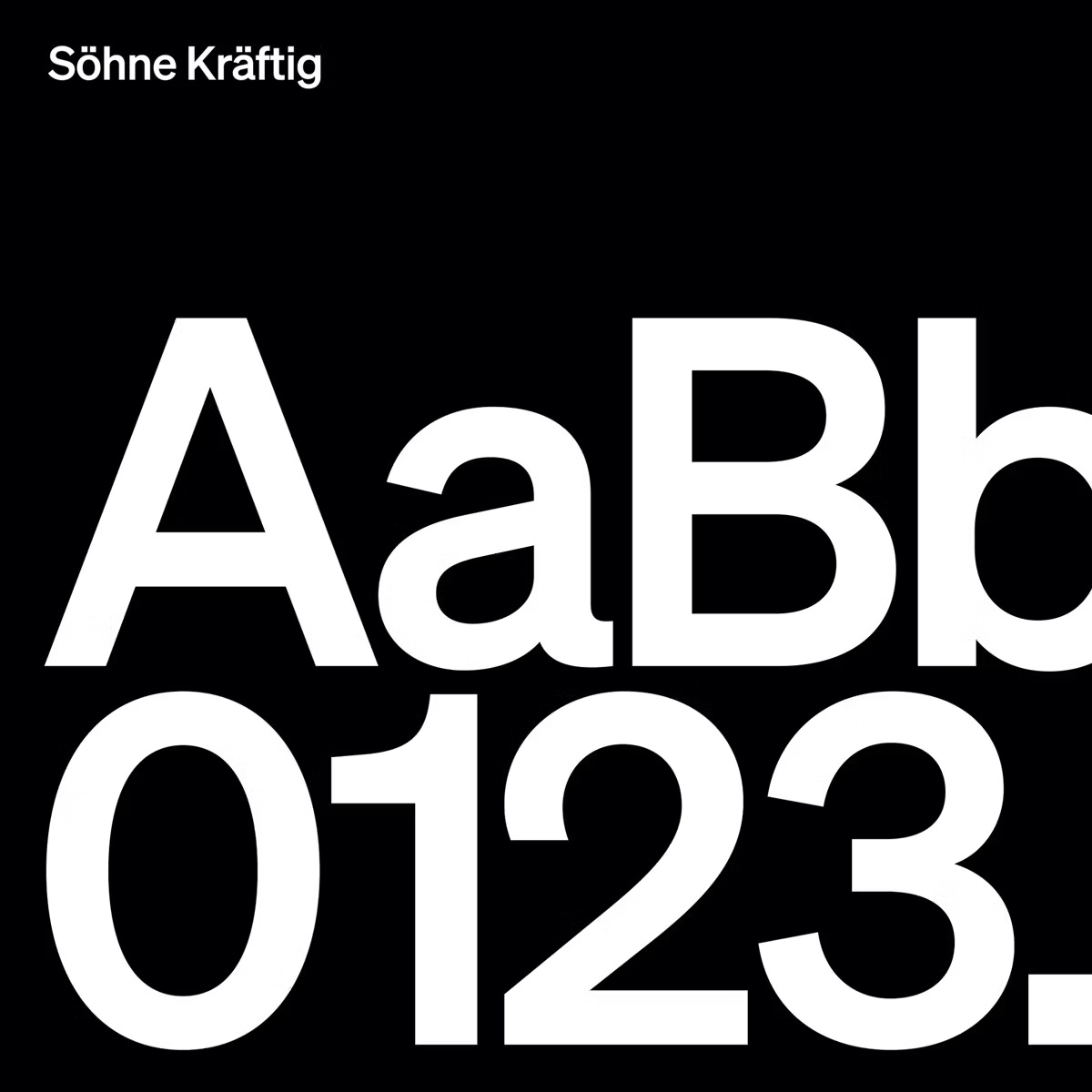
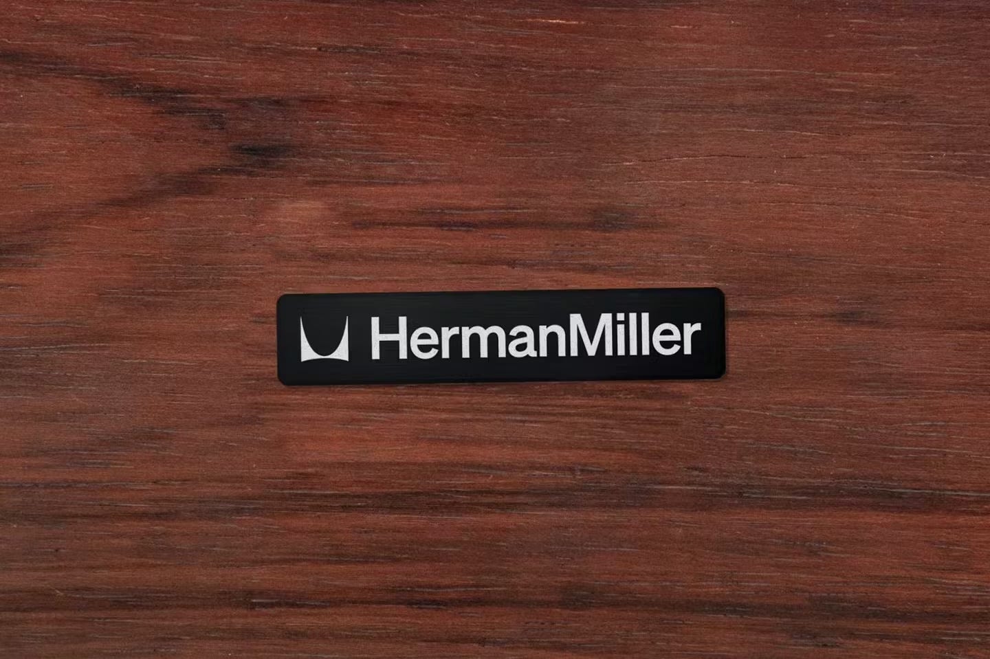
Only thing I would add is some more insight into the identity’s design details. Two areas are most obvious—what has changed and what has stayed the same. This comes through the logo, which features the historic “M” symbol designed by Irving Harper in 1946, unchanged but refined to work across various mediums. Next to the symbol is a more noticeably revised component, the wordmark, which is now set in Söhne from their previous typeface, Meta. Changing the symbol was never an option for us, as it’s the most consistent and long-lasting piece of their brand heritage, but the typeface was something we thought could use more purpose and function. Choosing Söhne (designed by Kris Sowersby of Klim Type Foundry) was a reference back to the period I mentioned earlier, where Herman Miller really hit their stride in combination with the products they were designing as well as the graphic language supporting the brand. During the Massey era they were strictly using Helvetica, and if you look back these materials, they never broke the system—this became glaringly powerful in execution and purpose. Consistency aside, the “grotesque” type family has also become synonymous with modernism, a category that Herman Miller has come to define through furniture and lived-with objects. The update is both bold and quiet at the same time, allowing the products to take the spotlight.
Supporting the new identity is a much brighter and full color palette. We took these hues directly from earlier palettes when the brand used them more expressively, before a more dialed-down palette was introduced in their most recent years. Although we agreed the Herman Miller “red” was critical to maintain, it didn’t need to be so restrained. The additional colors are meant to be used throughout the system, in as many places as they’re needed, giving their design team the ability to increase interest and functionality at the same time.
You’ll see much more of the system and how it works over the next six months as the team continues this transition!
Major shout out to Jesse for answering my questions. I am looking forward to seeing how this rebrand unfolds over the coming months. That’s all for today, talk to you tomorrow!
About the Writer
Jake Bell is a content marketing and creative strategist based in NYC. He specializes in content creation, branding, art direction, creative strategy, and making things cool.
To learn more about Jake visit www.jb.studio
Have a tip email me jake@jb.studio
Like video? Check out his TikTok
Like fit pics and pictures of chairs? Visit his Instagram.


