

I Love SSENSE's New Billboards 🫶
and more on minimal advertising

Good morning everyone, hope you all had a nice weekend. I took the weekend off to have fun, get my outfit filmed in Williamsburg (go check out @sidewalkedition), and eat a delicious chocolate torta at Altro Paradiso last night 🖤
But now we are back on the grind— today I want to discuss the new SSENSE billboard campaign and the trend of minimalistic advertising.
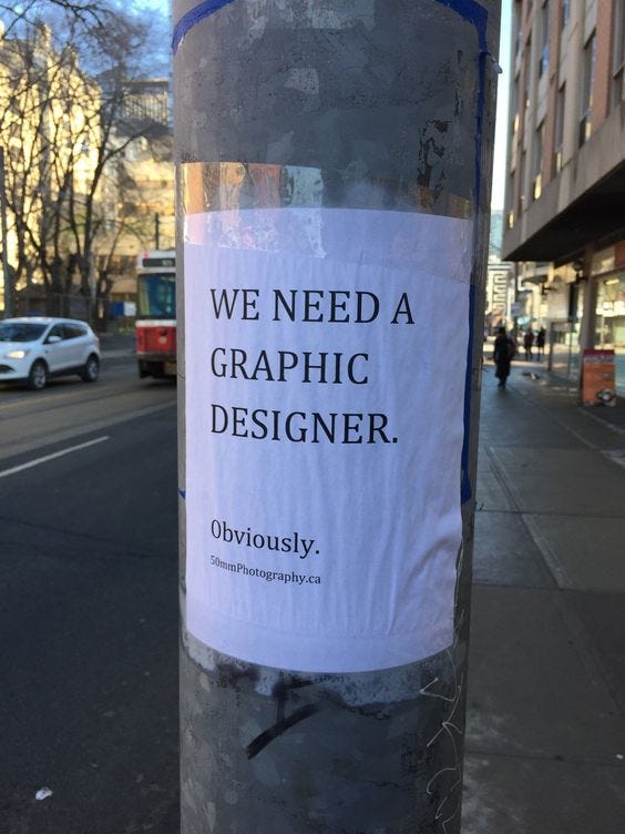
Have You Seen This Ad?
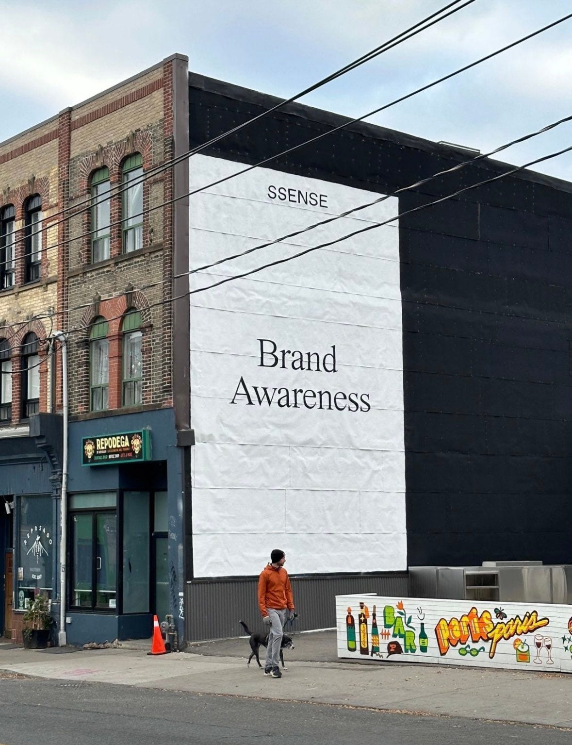
SSENSE just launched their first physical advertising campaign in NYC. The ads are starkly minimal, featuring minimal serif typography, a black and white color palette, and the classic SSENSE logo. The above ad is a meta take on billboard advertising, directly stating what the ad’s goal is: brand awareness.
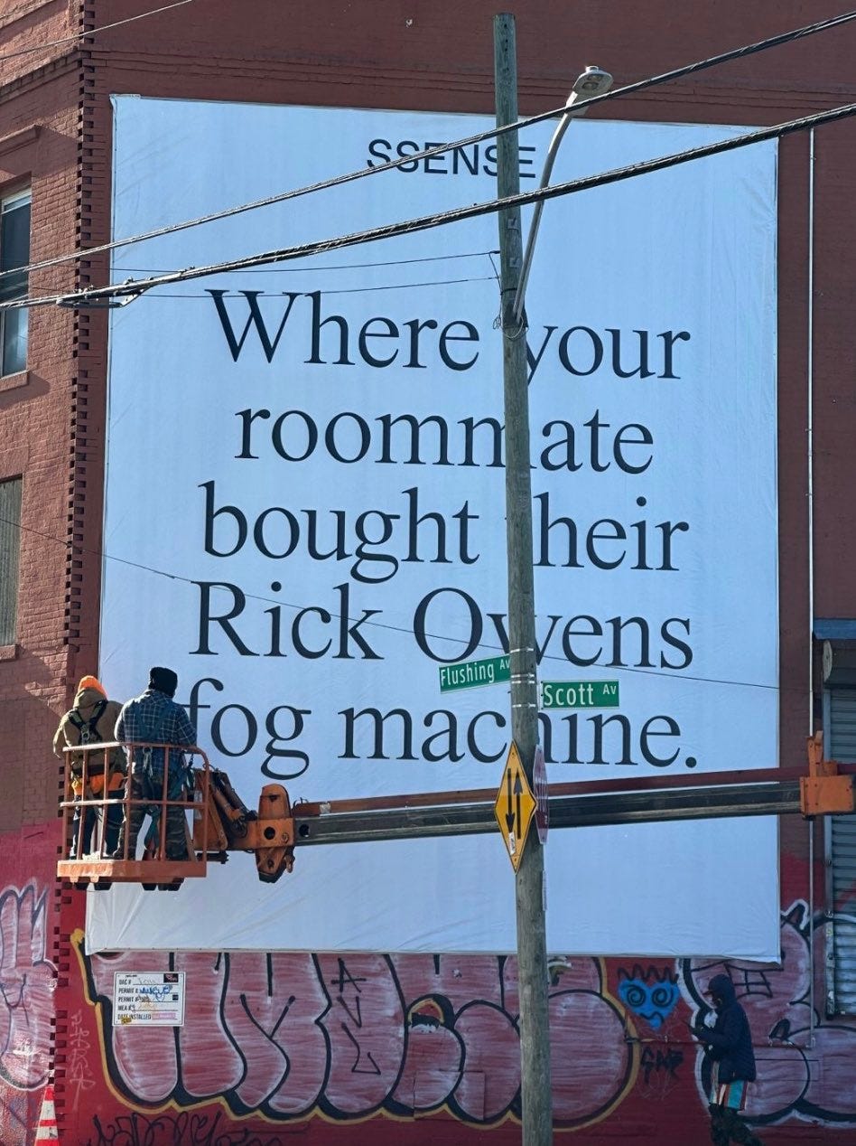
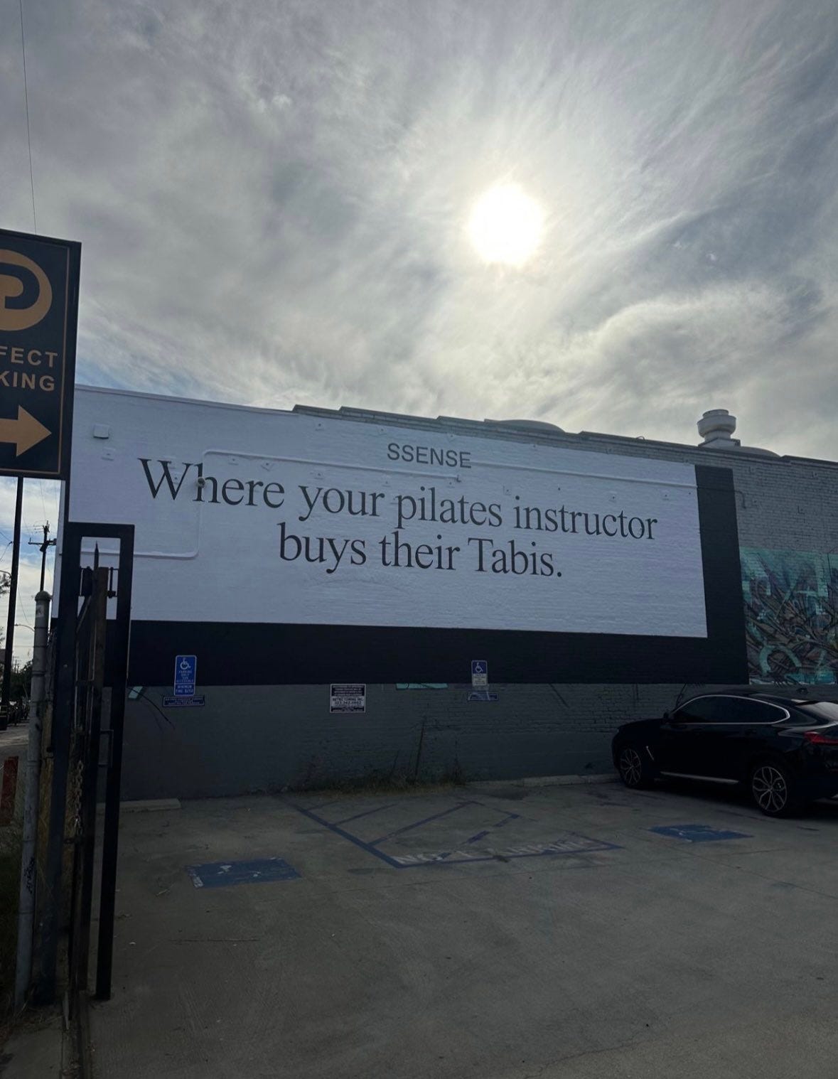
My favorite part of this new campaign is the clever copy, referencing popular SSENSE staples and relativizing them in the context of the consumers life. Although this ad campaign seems intensely simple, I am sure hundreds of variations of copy were reviewed (seeking confirmation this) before going to market.
On Brand
SSENSE’s website has always been a minimalistic paradise. In recent years, their social media content has adopted this branding and expanded their brand universe with a signature SSENSE meme format.


SSENSE’s minimal, fashion focused memes play into trends and consumption culture. These billboards are a further extension of this. They are having fun in their own way and using their marketing collateral to convey that.
In the context of billboard ads, these stand out as they are so simple, clean, and to the point. We are seeing this trend more often…
Minimal Billboards

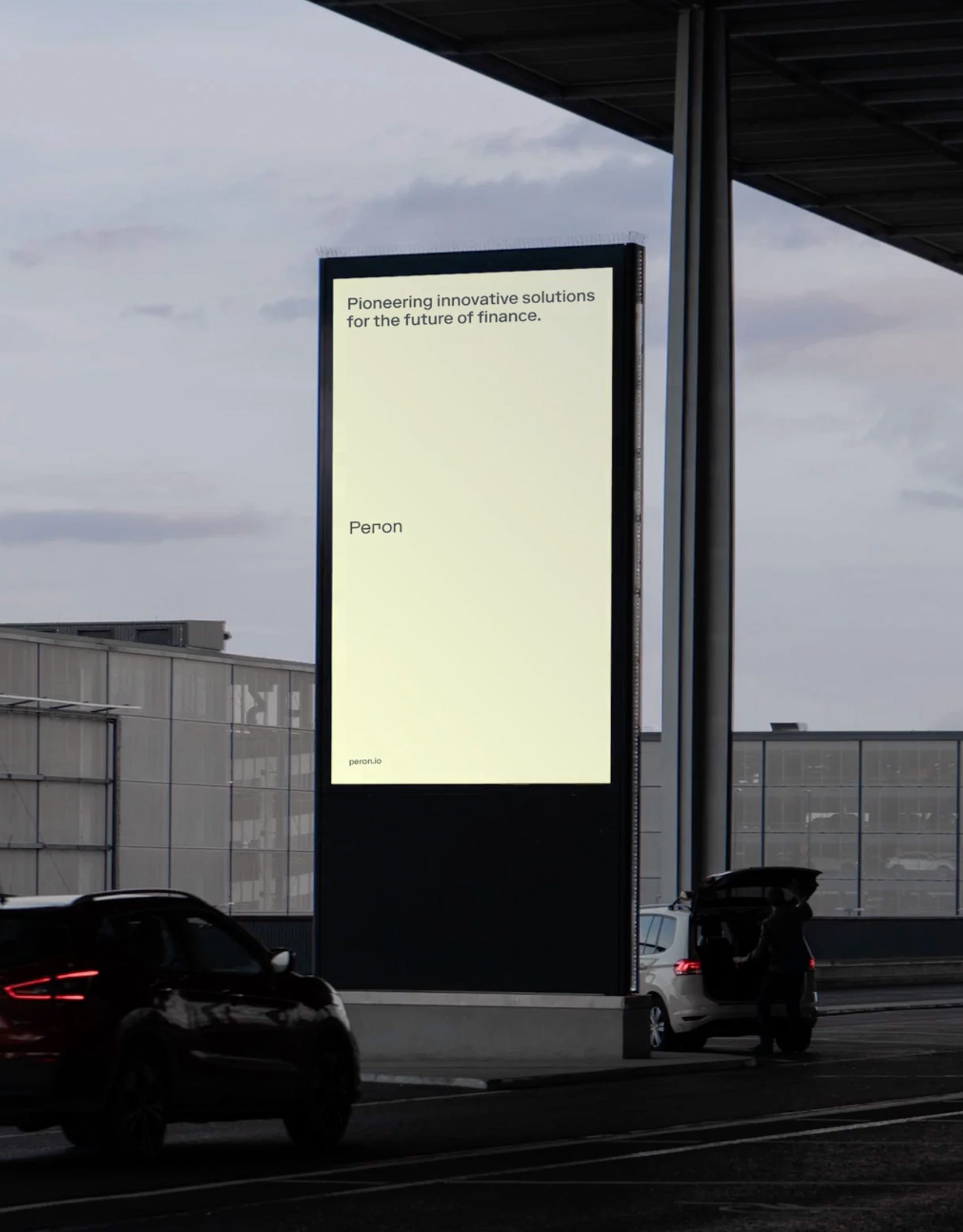
In a world of crowded messaging and over-design, the above examples from Peron and Intercom strip away all the BS and get right the point. They may seem simple, but that is the point. Get the message out with as little barriers as possible, and offer a clean design with nothing you don’t need to understand the brands at a 30,000ft level. We are rebooting the global design computer and starting fresh.
As Little Design As Possible
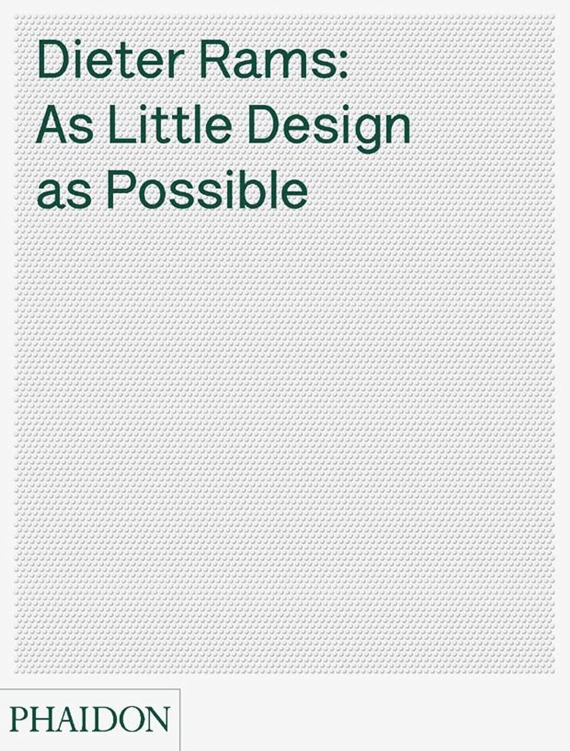
Dieter Rams once said that good design is as little design as possible. Minimal billboards present an interesting case study in how messages can be more concise and achieve their goal when we remove unnecessary design elements. Take the QR code off the ad….
Surf or Drown
Virgil Abloh was a mimimal advertising king. Let’s end today’s newsletter with wise words—
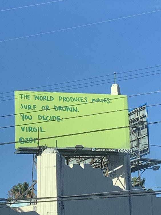
are you surfing or drowning this week?
About Jake
Jake Bell is a content marketing strategist based in NYC. He specializes in branding, art direction, creative strategy, content creation, and making things cool.
To get in touch visit www.jb.studio
Like video? Check out his TikTok
Like fit pics and pictures of chairs? Visit his Instagram.