🟢 How to Use Color In Your Brand 🔵
Understanding color theory, Kylie Jenner's PE deal, Every Other Thursday's popup, Buzzfeed's new investor, and more.
GM everyone. I’ve been having a… week, so last night I went to the park after work and read ‘A Little Life’ for a few hours to get away from screens.
Have you guys read this book? It’s so f*cking sad? I’m almost finished with it, let me know in the comments if you’ve read it.
Today I want to talk about—
How color can be leveraged to build brands
Kylie Jenner’s Beverage Brand
Jeans you are about to see out all the time
Buzzfeed’s impending right wing shift
and more.
🟣🔵🟢🟡🟠🔴 HOW BRANDS USE COLOR 🟣🔵🟢🟡🟠🔴
Choosing a strong brand color is often one of the hardest decisions a new brand can make. Color theory suggests certain shades evoke internal psychological feelings, and can be used by brands to affect customer behavior. For example, the red and yellow used by McDonalds’s actually makes us want to buy a Big Mac. Psychologists say red triggers stimulation, appetite, and hunger, and yellow triggers happiness and friendliness.
Shades of blue can communicate dependability and trust, whereas shades of green evoke a feeling of growth.
Understanding this theory is important, but so is using it to break the rules.
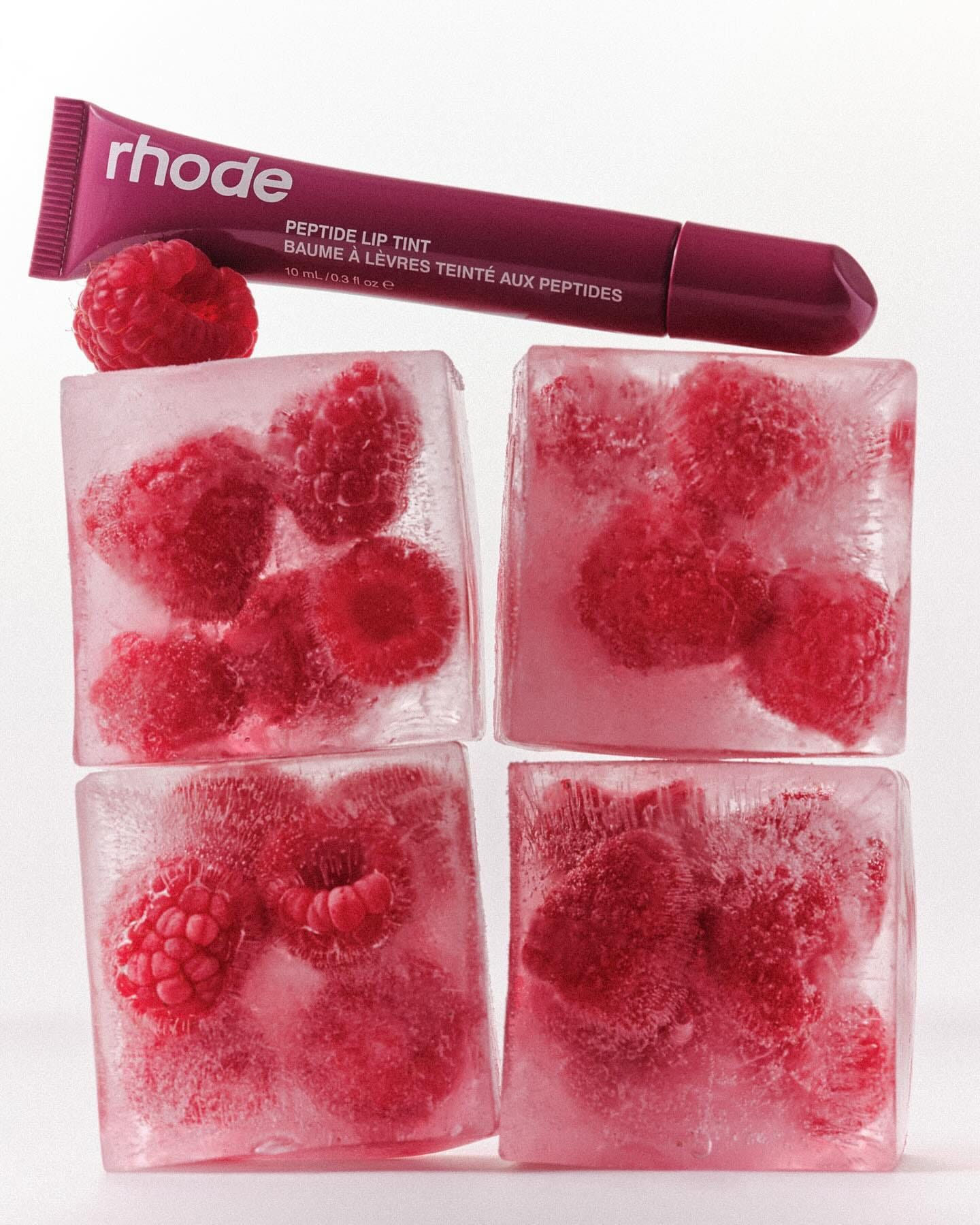
Oftentimes industries stick to the same color tropes. Beauty brands consistently use pinks, mauves, reds, and purples. Fast food giants like McDonald’s and Wendy’s use red. Health food chains that serve salad consistently use green.
But if you’re designing a new brand, taking stock of these tropes and designing against them can oftentimes yield unexpected results that help you stand out amongst the competition, especially if you’re brand strategy is disruption.
Once you have a brand color, using it across every touch point over time will create an association between your brand and that particular color.
We can’t look at light teal without thinking of Tiffany’s, or bright orange without thinking of Hermes (funny enough Hermes’ orange was adopted because they could only source that dye during WW2). These legacy brands have used their brand colors so consistently that we have developed an intrinsic connection between the shade and the brand, without ever having to see a logo.
I was working on some designs recently when it hit me that sage green is now forever synonymous with Blank Street, which uses the shade across their storefronts, coffee cups, social media, emails, etc.
Some brands have even famously trademarked their distinct shades and color combinations. Target has the lock on bright red, John Deere on green/yellow, and T-Mobile with their bright pink.
So when crafting a new brand here are some quick tips on color—
Take stock of color theory and how colors affect consumers psychologically
Look at your competitors and determine if eschewing a trope is to your advantage
Use your signature color consistently across every brand touch point, until you own that color.
Here’s a free website that helps you mockup color combinations for UI/UX:
NEWS
Kylie Jenner’s canned vodka soda brand, Sprinter, received a big investment. According to CPG Wire, the new brand raised $12.5M in PE investment, after shipping 140,000 cases in their first month. When the brand launched in March, I critiqued it a little, noting that Kylie has a history of launching a ton of brands that eventually fizzle out, and how it could be diminishing her own brand equity with her audience, and tiring consumers. But maybe I am wrong and people just want a nice canned vodka soda brand for the Summer? What do you guys think is the future of Sprinter?
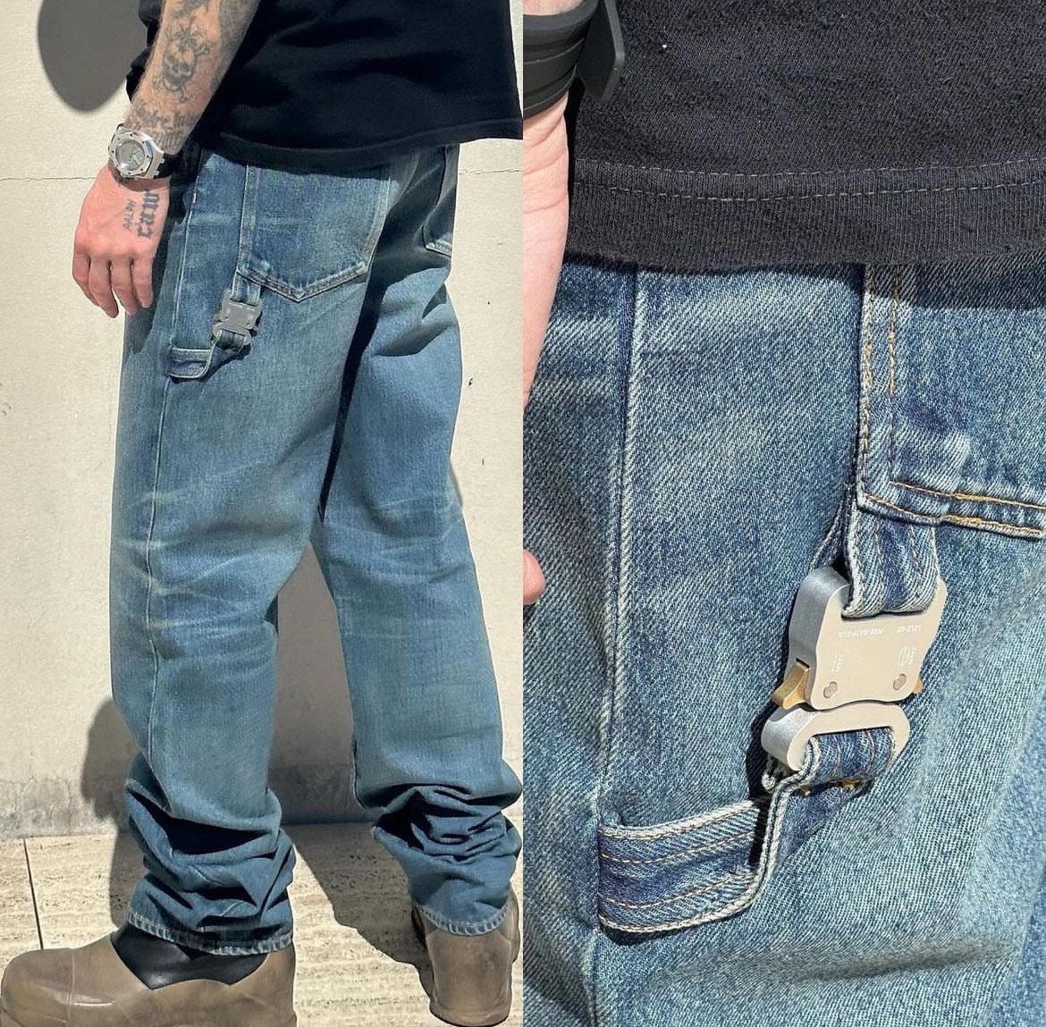
Alyx is launching Japanese-denim carpenter pants. Mathew Williams brand is hopping on the carpenter denim wave a little late, they’ve been popping for quite some time. Their take is done in Japanese denim, and features their signature roller coaster buckle on the hammer loop. I am not really sure who the target customer for them or Alyx as a brand is anymore?
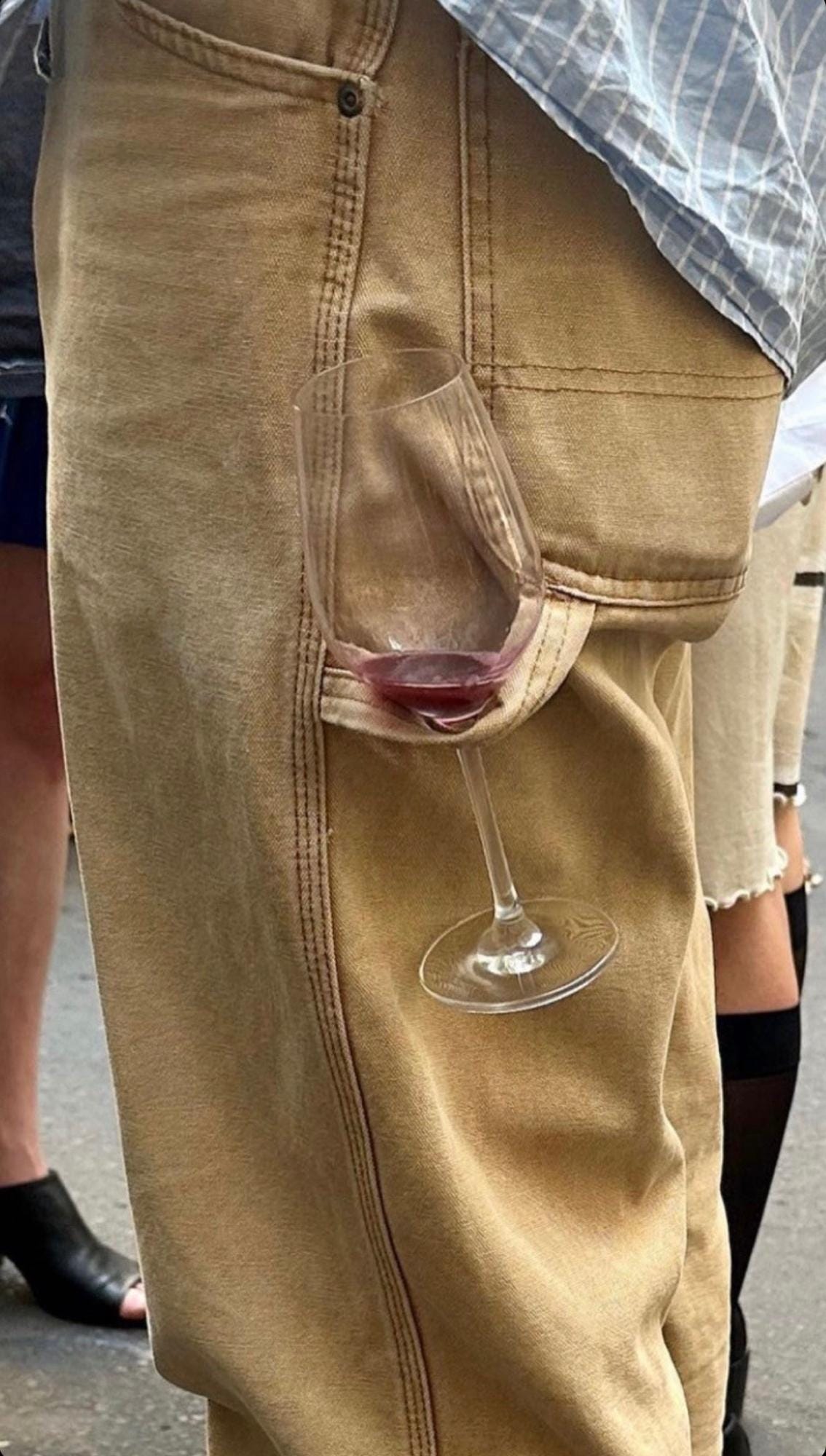
Some designers lean a bit too heavily into the motif that garnered them their initial popularity. I can think of the tags Off-White was doing on all their shoes as an example of a design motif that grew tired after it wasn’t fashionable anymore. I still think carpenter jeans are cool, and I am loving all the examples of natty-wine bros holding wine glasses on them instead of a hammer.
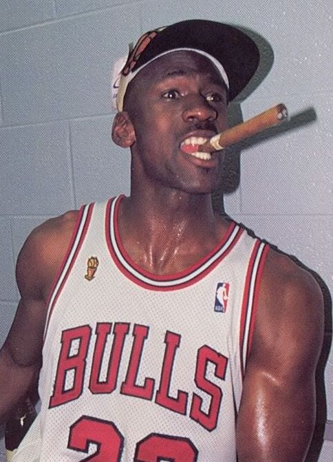
Vivek Ramaswamy is becoming an activist investor in Buzzfeed. The tech mogul and former presidential candidate acquired a 7.7% stake in the failing media conglomerate that formerly dominated millennial internet culture in the 2010s. Ramaswamy plans to ‘shift the company’s strategy’ and honestly he could probably help. Politics aside, Ramaswamy made a major showing in the Republican primary despite the inevitable outcome (did you guys know Trump is holding a rally in NYC today? LOL) due in part to his content and digital media strategy. He’s young and he and his team understand how to drive buzz with certain cohorts. Is Buzzfeed going right wing? Who knows but its safe to say a rightward shift has been substantially lucrative for many media personalities and podcasters. As Michael Jordan once famously said, “Republicans buy sneakers, too”
Every Other Thursday is having a popup this weekend in Williamsburg. Ethan Glenn’s moodboard turned clothing brand (a la Sporty & Rich) is coming to NYC for a popup at 349 Kent Ave the 25th-27th. I like Ethan’s content and think the brand has a nice aesthetic, I’ll probably stop by if I have time. Not to be a hater, but why is it that every single moodboard turned clothing brand uses the exact same signature color. Minted, Hidden, and EoT all use a deviation of forest green, which I’d argue Aime Leon Dore helped bring back to the forefront in the context of menswear. Forest green is my fav color too but maybe its a little overused…
did an interview on finances with and I really liked her comments on being confident in your worth as a consultant/freelancer.
How do you get comfortable holding that boundary of you as a business? It’s definitely a shift from theory to practice.
It’s a repetition game. After 250 meetings, it becomes easier to suss people out. Every time I send a proposal, I’m less and less attached to the outcome of it, which is great.
Its true, oftentimes sending proposals out can be tough and come with feelings of nervousness, imposter syndrome, and trepidation. But as Erika says, practice makes perfect and the more proposals you send out, the more confident you’ll be in your worth, including learning what types of clients you don’t want to work with.
I can think of a few myself…
BYE SEE YOU TOMORROW!
Jake Bell is a content marketing and creative strategist based in NYC. He specializes in content creation, branding, art direction, creative strategy, and making things cool.
Want to work together or chat? Email me: jake@jb.studio





i love a little life but be prepared for waterworks
If a little life has no haters I am dead