Can Härman Make Coffee Sexy?
Insights on marketing, business, branding, products, design, founders, and culture.
GM everyone.
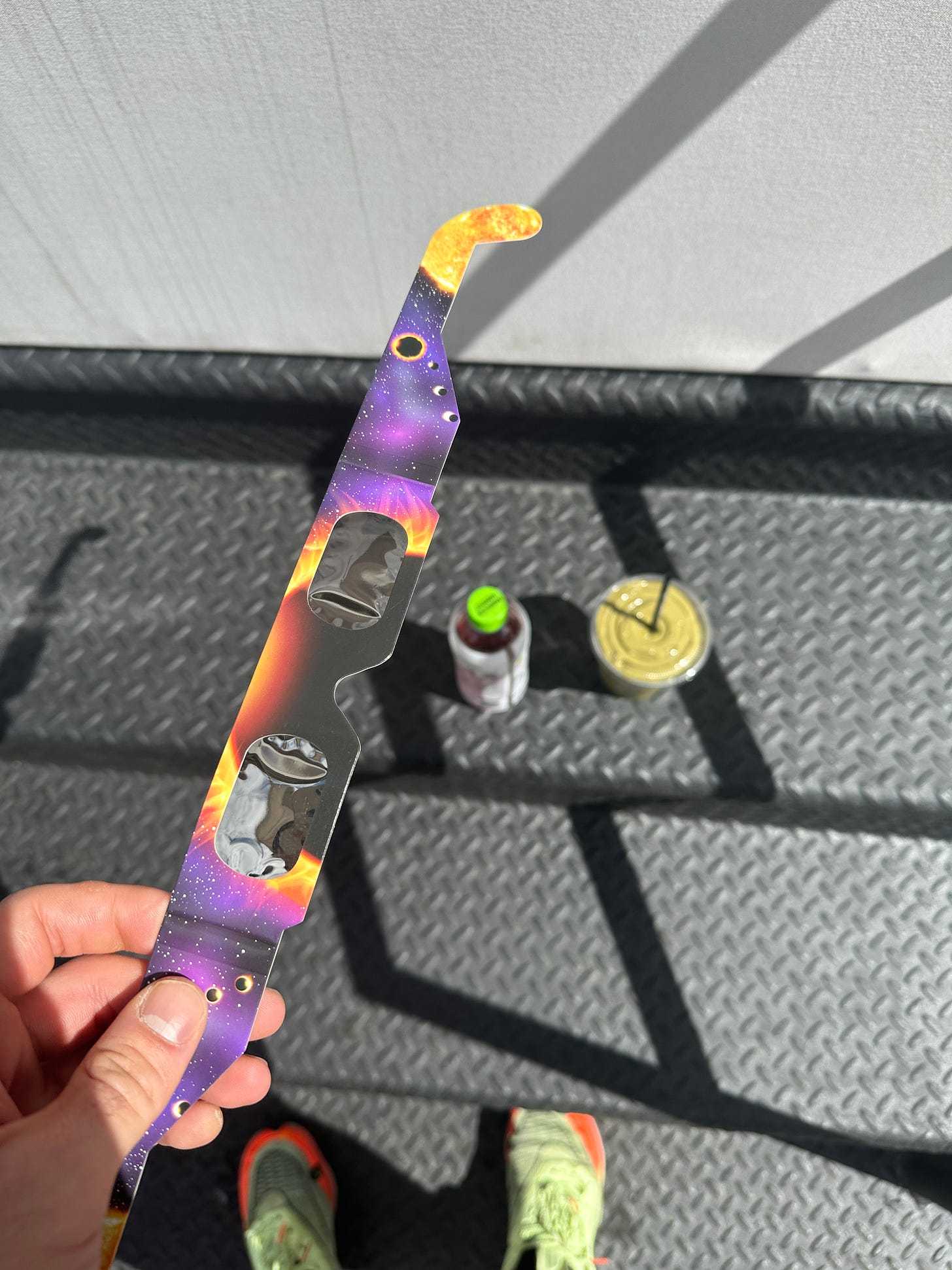
The solar eclipse is happening today and originally I didn’t really care until I was given a free pair of eclipse glasses at Happier Grocery yesterday. Now I’ll actually be able to see it without going blind.
So if you want to stop working for 5 minutes this afternoon and check it out, go get a strawberry matcha (with whey) smoothie from Happier and a complementary pair of glasses.
Here’s the news—
News
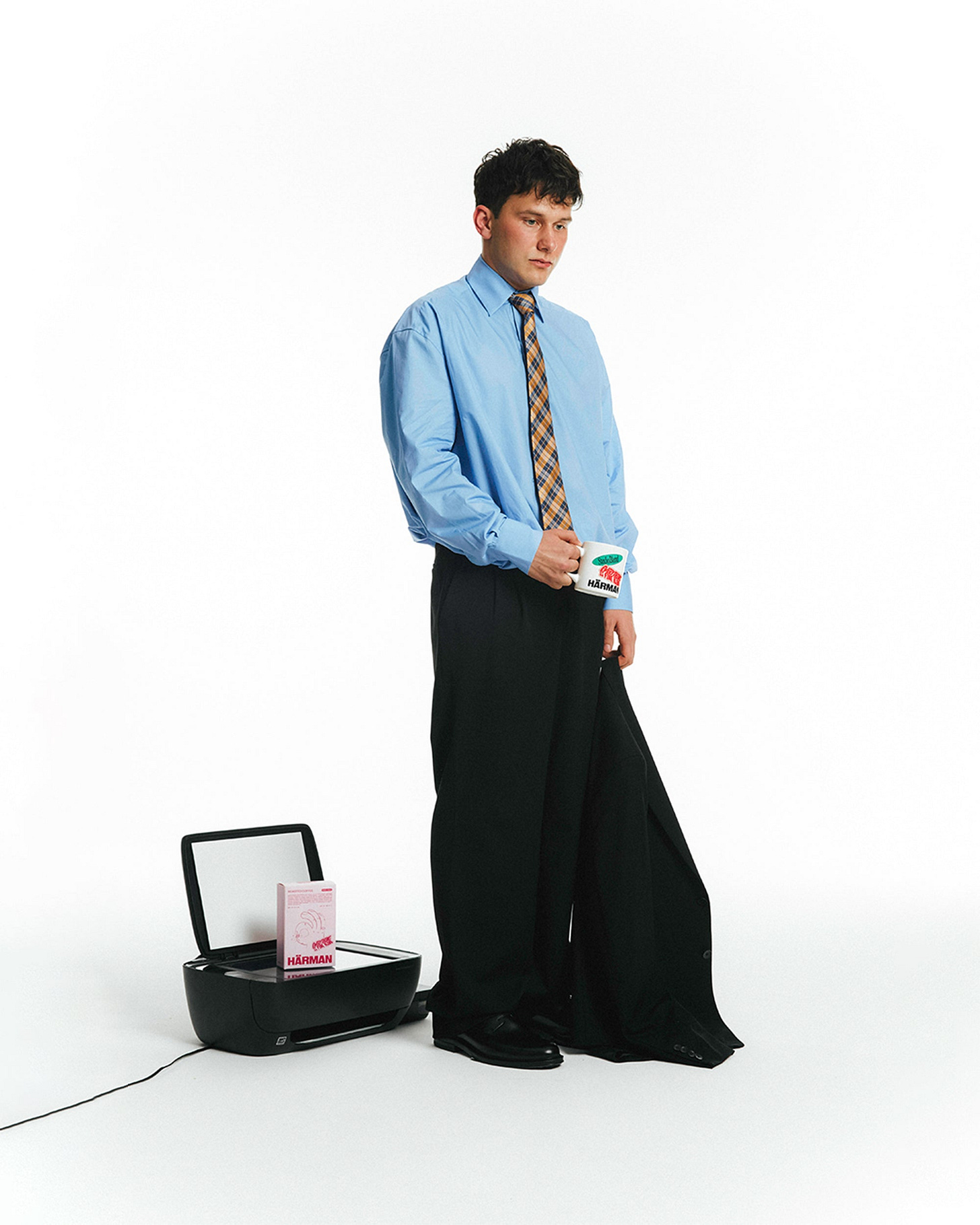
This coffee brands branding and art direction is DIFFERENT. Over the weekend I saw Snaxshot post about Harman Coffee’s unique branding and campaigns. The Turkish coffee brand & creative studio (LOL) combines two popular art direction elements: two colors, and illustration on their packaging.
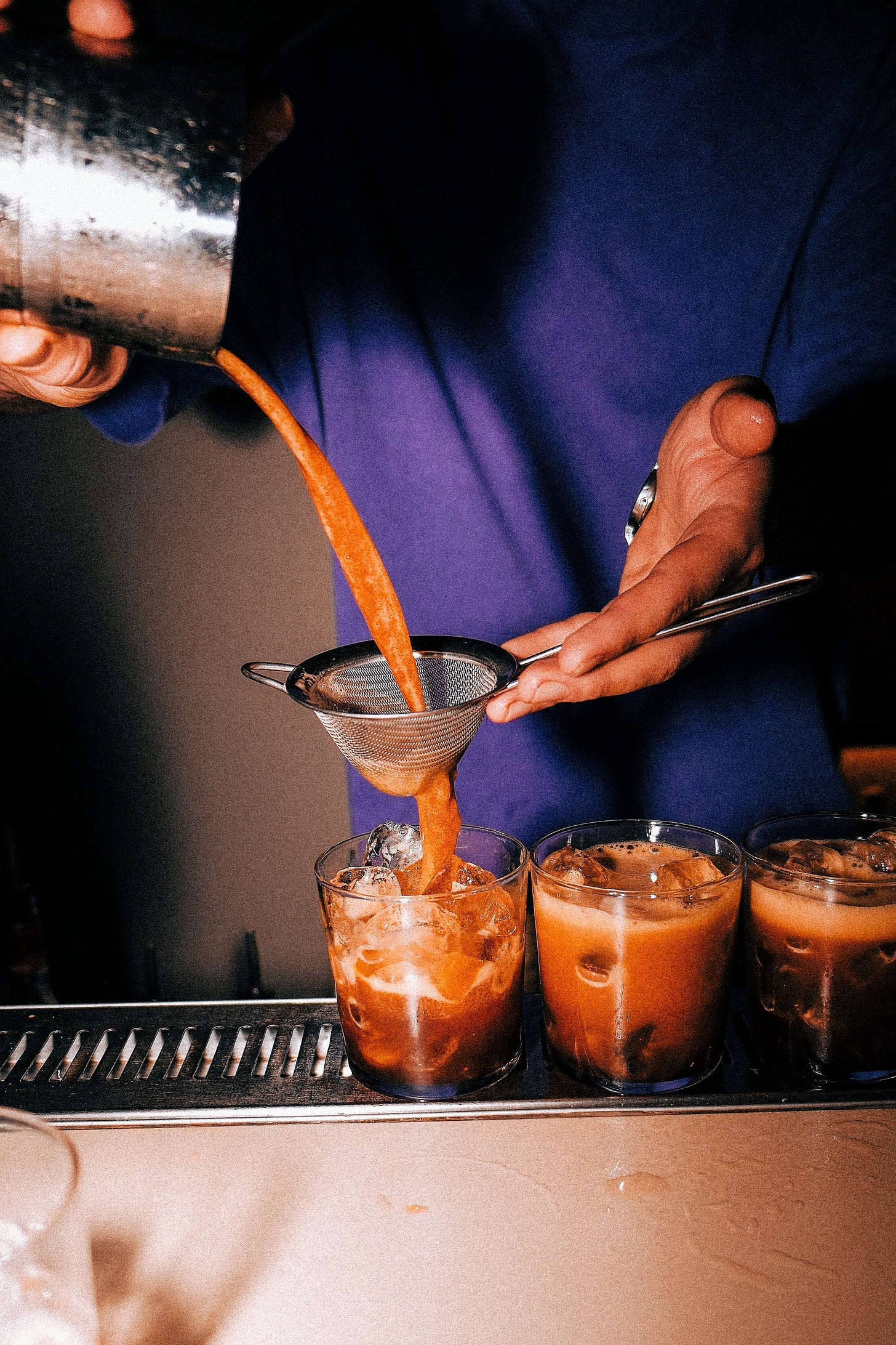
As I dove deeper, I saw the brand makes a lot of intentional creative decisions to stand out from other coffee brands. While most go for the slow Sunday morning or cute cafe vibe, Harman’s photography feels reminiscent of fashion editorial shoots or #35mm night out photos.
It features flash photos of the lattes being made, trendy fashion choices, and a night life vibe. They also ripped off one of New Balance’s classic ads.
In my opinion, Harman has successfully differentiated itself with these bold, divisive choices, which serves as an important lesson for other brands trying to stick out in a crowded field. Look around at your competition and try to bring something new to the table. Some will hate it, but the goal is to attract ardent fans who discover something they didn’t know they needed and become massive fans. In this case, Harman is decidedly trying to come across as cool, youthful, and fashionable.
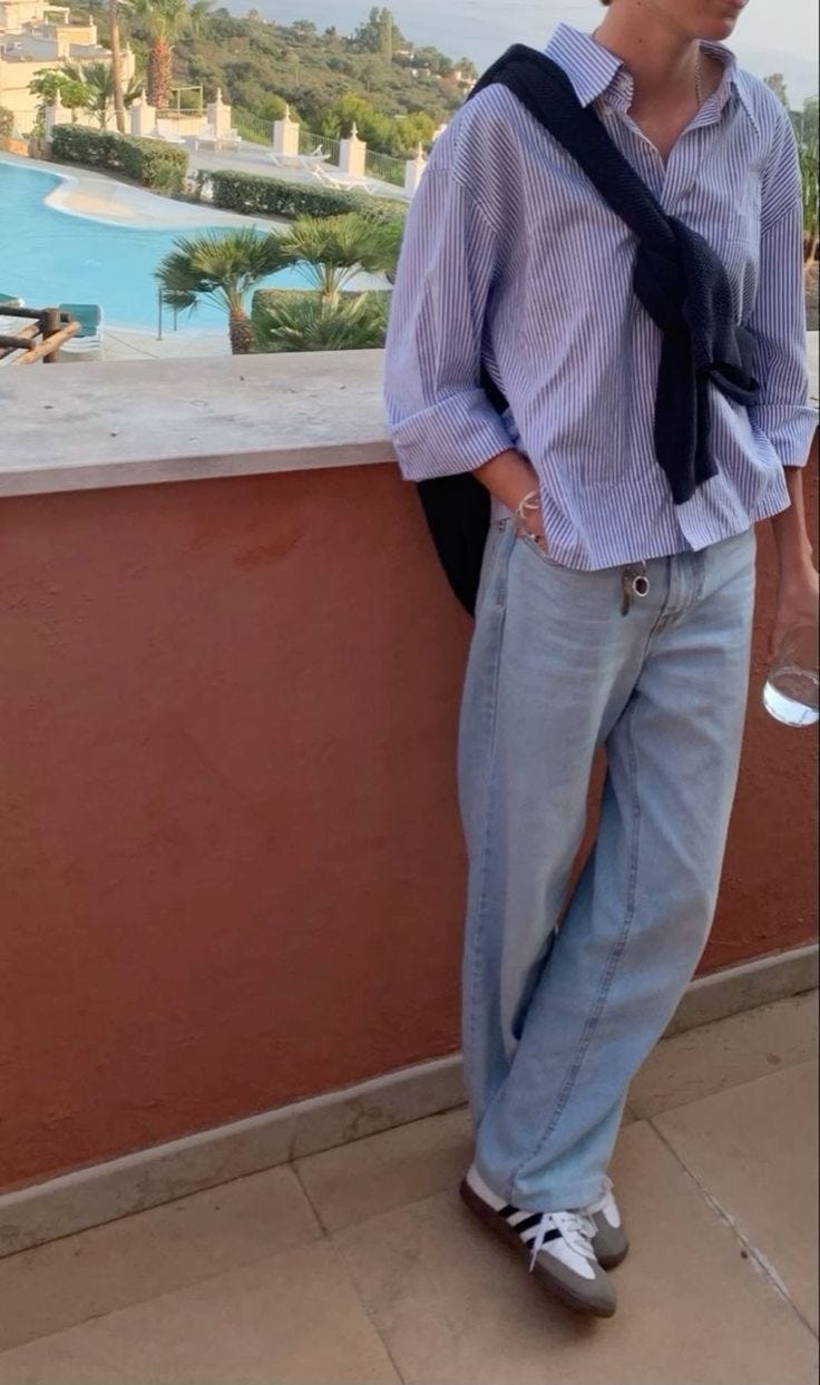
Gen Z is obsessed with the old money aesthetic. More and more young people are dawning cable knit sweaters, oxford shirts, and boat shoes. GQ reports the hashtag ‘#OldMoneyAesthetic’ has nearly 360,000 posts on Instagram, and this shift is palpable on the streets.
The fetishization of 90s Ralph Lauren and J. Crew, and moodboard photos of John Kennedy Jr. and Caroline Bessette has roots in moodboard pages turned brands like Emily Loves Sporty & Rich or Ethan Glenn’s Every Other Thursday, who take major inspiration for their collections and campaign shoots.
The linked article attempts to explore the reasoning behind this shift. Could it be the yearning for preppier clothing in a post-COVID world, where dressing up is not required if you work a normal 9-5 anymore? Is it a nostalgic look back to a simpler time in the American lexicon? Does it signal wealth and status? Either way, the old money aesthetic is going to be popping for quite some time. Currently wearing a striped blue oxford as we speak.
Looking to decorate your apartment for the low? Look no further. Dupe.com is the PLUG for finding the most aesthetic furniture dupes. Basically the site curates the trendiest Instagram explore page furniture, and connects you with a cheaper duplicate from another website. They’ve found a Togo dupe for $1,000 and a Herman Miller Eames dupe for just $600!!!
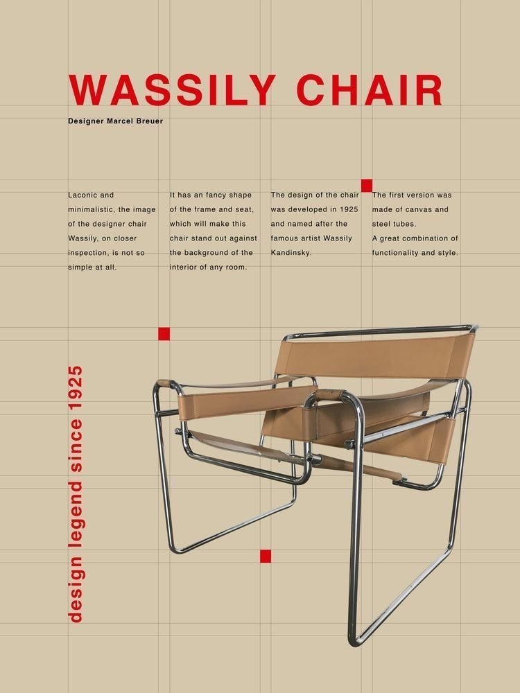
I am going to keep this site bookmarked for when I move apartments later this year. Hopefully by then they have a Wassily Chair by Marcel Breuer.
Who Do You Know? is a daily newsletter covering marketing, business, branding, products, design, founders, and culture.
Its written by Jake Bell, a content marketing and brand strategist in NYC.
To get in touch visit www.jb.studio or email jake@jb.studio







the way we triggered the internet with that brand over the weekend lol